Toggle Button in JavaScript: A Practical Guide
Learn to build accessible, reusable toggle buttons in JavaScript with keyboard support, ARIA attributes, and scalable patterns. Step-by-step instructions, code examples, and testing tips for robust UI controls.

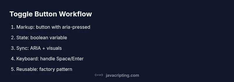
By the end of this guide, you'll implement a reusable toggle button in JavaScript. You’ll create accessible markup, attach a single event listener, manage internal state with a compact data model, and ensure keyboard and screen reader support. This approach scales from a simple on/off switch to a feature-rich component for modern web interfaces.
Understanding the toggle pattern in the DOM
A toggle button is a control that flips between two states—on and off—while reflecting its current status in both visuals and data. In practice, a semantic button element with a state flag is the most reliable approach. The DOM representation should mirror the UI state so assistive technologies can announce the change. According to JavaScripting, a properly implemented toggle should always provide a clear visual cue and the corresponding data signal, so users relying on keyboard navigation or screen readers receive consistent feedback. This section lays the foundation by differentiating a toggle from other interactive controls and outlining common patterns used across modern web apps. When you think in terms of a stateful UI component, you’ll design with a single source of truth that the DOM and JavaScript share.
Accessible markup for a toggle
A toggle button should be keyboard accessible and semantically correct. Use a real button element when possible and manage its aria-pressed attribute to reflect the current state. If you must use a non-button element, apply role="button" and keep keyboard support consistent with native buttons. The markup should include meaningful aria-label or aria-labelledby so screen readers can announce the action accurately. The visual label should update in sync with the state to avoid confusion. Consider defaulting aria-pressed to false and updating it as the user interacts. This approach improves inclusivity and aligns with best practices in web accessibility.
Code example:
<button id="toggle" aria-pressed="false" aria-label="Toggle feature" class="toggle">Off</button>State management and data model
State management for a toggle button centers on a simple boolean that represents the current state. Keeping this state in a single variable avoids drift between what users see and what the code uses to drive behavior. The button element should mirror this state through aria-pressed, text content, and visual classes. A concise data model makes the component reusable and easier to test. When the state changes, all dependent UI updates should run synchronously to prevent stale visuals. In JavaScript, encapsulate state logic in a small module or function so it can be reused for multiple toggles across a page or app.
Example concept:
let isOn = false;
const btn = document.getElementById('toggle');
Wiring behavior with JavaScript
Connecting user events to state updates is the heart of a functional toggle button. Attach a click event listener to the toggle element and implement a toggle function that flips the boolean, updates aria-pressed, and adjusts visuals. Keep the function pure with clear side effects: updating the DOM and any related content. This approach reduces bugs and makes the component predictable. If you have multiple toggles, consider a lightweight factory that returns a toggle instance bound to a specific element.
btn.addEventListener('click', toggle);
function toggle() {
  isOn = !isOn;
  btn.setAttribute('aria-pressed', String(isOn));
  btn.textContent = isOn ? 'On' : 'Off';
  btn.classList.toggle('on', isOn);
}
Styling the toggle for clarity
Visual clarity matters for user feedback. Use distinct states for on/off, with colors, icons, or typography signaling the current status. Style should reinforce state changes without obscuring function. Prefer CSS transitions for a smooth toggle experience, and ensure high contrast for accessibility. If your UI contains other controls, maintain consistent sizing and spacing to avoid a cluttered interface. A well-styled toggle communicates state at a glance and reduces cognitive load for users.
.toggle { padding: .5rem 1rem; border: 1px solid #333; border-radius: .5rem; background: #222; color: #fff; cursor: pointer; }
.toggle.on { background: #0a5; border-color: #0a5; }
Testing, accessibility checks, and browser considerations
Testing a toggle button goes beyond functional clicks. Verify ARIA attributes update correctly, test keyboard interactions (Space and Enter), and ensure screen readers announce the state change. Check contrast ratios, focus order, and that the toggle remains operable in different browsers. Consider automated tests for the two states and manual checks on assistive technology to confirm accurate announcements. Cross-browser quirks can affect focus rings and key handling, so validate in at least Chrome, Edge, and Firefox.
Pro tip: use aXe or Lighthouse accessibility audits to surface issues automatically and iterate quickly.
Reusable toggle component: from simple to scalable
A scalable approach treats the toggle as a small, composable component that can be instantiated for multiple controls. Encapsulate the behavior in a function or class that accepts a root element, handles state, manages ARIA and visuals, and exposes a minimal API for integration with UI frameworks. The goal is to reduce duplication while preserving readability and testability. As your project grows, you can attach additional features—labels, grouped toggles, or multi-state variations—without rewriting core logic.
In JavaScript projects, a reusable toggle component often looks like a factory that returns an object with methods to get the current state, set a specific state, or toggle programmatically.
Performance and cross-browser considerations
Performance is rarely a bottleneck for a single toggle, but if you render large lists of toggles or animate many elements, micro-optimizations matter. Delegate event handling to container elements when possible to reduce memory churn, and avoid unnecessary DOM reads by batching state updates. For accessibility, ensure that ARIA attributes update synchronously with visual changes and that layout remains responsive on different viewports. Be mindful of custom elements or shadow DOM usage, as these can affect focus management and event propagation in some browsers.
Real-world patterns and takeaways for production
In production apps, you’ll frequently reuse the toggle component across forms, filters, and settings panels. Common patterns include a factory that attaches to any button element with a data-toggle attribute, and a small registry of toggle instances for bulk manipulation or testing. Remember to document the API surface for each toggle instance, including how to query its current state and how to programmatically force a state change. A well-documented, accessible, and reusable toggle button not only improves consistency but also reduces maintenance costs across teams.
Tools & Materials
- Code Editor(e.g., VS Code, Sublime Text)
- Web Browser(Latest Chrome/Edge/Firefox)
- Live Server (optional)(For real-time testing)
- Starter HTML + JS Snippet(Basic markup with a toggle button and aria-pressed)
Steps
Estimated time: 60-75 minutes
- 1
Create HTML structure
Add a button element with aria-pressed set to false and a descriptive aria-label. This establishes semantic intent and initial state for screen readers. Keep the markup simple and accessible by default.
Tip: Use a real button element whenever possible to preserve native keyboard behavior. - 2
Apply baseline styles
Define minimal CSS to distinguish on/off states and ensure focus visibility. Visual clarity helps users understand state changes at a glance.
Tip: Include a visible focus ring to meet accessibility guidelines. - 3
Attach a toggle handler
Register a click event listener that flips internal state and updates ARIA and visuals in tandem. Keep this as a small, testable function.
Tip: Keep the handler free of side effects and limit it to one toggle per click. - 4
Manage internal state
Store the current state in a boolean variable and synchronize it with the DOM. A single source of truth reduces bugs and makes testing easier.
Tip: Use a concise name like isOn or isActive for clarity. - 5
Update ARIA and text
Update aria-pressed and the button text to reflect the new state. This ensures assistive technologies announce the change accurately.
Tip: Guard against race conditions by updating state before DOM updates. - 6
Enable keyboard support
Ensure Space and Enter trigger the toggle, mirroring native button behavior. This is essential for keyboard-only users.
Tip: Prevent default behavior for Space to avoid page scrolling in long forms. - 7
Make it reusable
Wrap the logic in a factory or class so you can instantiate multiple toggles on a page without duplicating code.
Tip: Expose a small API like getState, setState, and toggle for flexibility. - 8
Test and validate
Test across browsers and with assistive tech. Validate keyboard interactions, ARIA updates, and visual cues in real conditions.
Tip: Automate baseline tests where possible and perform manual accessibility checks.
Questions & Answers
What is a toggle button in JavaScript?
A toggle button is a binary control that switches between two states, typically on and off. It uses ARIA attributes to announce state changes and is keyboard-accessible when implemented with a real button element. The goal is consistent feedback for all users.
A toggle button is a two-state control that switches between on and off, announced clearly by assistive technologies and accessible via keyboard.
Why should ARIA attributes be used on toggles?
ARIA attributes communicate dynamic state to assistive technologies. aria-pressed, aria-label, and proper role help screen readers convey the exact status to users who cannot rely on visuals.
ARIA attributes describe the toggle state to assistive tech, making it accessible to all users.
Can I use a div for a toggle with role='button'?
If you must use a non-button element, add role='button' and implement full keyboard support (Space and Enter). Prefer native button elements whenever possible for simplicity and accessibility.
Using a div is possible but more work; a real button is recommended for accessibility.
How should I handle keyboard input?
Treat Space and Enter as activation triggers, preventing page scroll where appropriate. Ensure the toggle state updates before any visual changes to keep interactions deterministic.
Handle Space and Enter like a real button, and update state consistently.
How do I test the toggle across browsers?
Test on Chrome, Edge, and Firefox for consistent keyboard behavior, ARIA state updates, and visual feedback. Use automated checks when possible and supplement with manual testing for assistive technologies.
Test in major browsers and with assistive tech to ensure consistency.
Is a toggle always two-state, or can it be multi-state?
Toggles are typically two-state, but patterns exist for multi-state controls. If you need more states, consider a separate control or a component that clearly communicates all possible states.
While toggles are usually two-state, some patterns support more states with clear UI cues.
Watch Video
What to Remember
- Use a real button with aria-pressed for accessibility.
- Maintain a single state variable to drive UI and ARIA updates.
- Ensure keyboard support mirrors native button behavior.
- Wrap logic in a reusable component for consistency.
- Test visually and with assistive technologies across browsers.